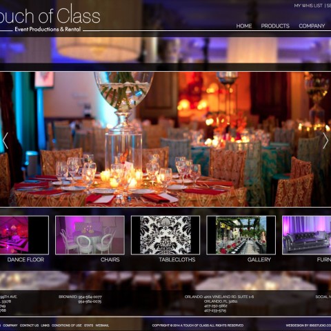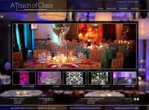
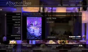
 “A Touch of Class” is a Event Productions & Rental company offering the best possible options for every event. From the fabric, to the chairs, to the furniture, every detail counts.
The store design is made by ibis studio a web design company based in Miami/Florida. Ibis designed a dark, semi transparent full width theme, that looks really very classy.
We implemented the design in osCommerce and did the store setup in terms of functionality.
The store has following setup
- osCommerce 2.3.3
- Mini template system 1.4.03_c
- Ultimate SEO url
- Security Pro
- Modular header tags
- Image thumbnailer
- Grid listing
- Accordion categories box
- MTS information pages
- Reduced fields in create account
- Masked checkout process
- Event date selection
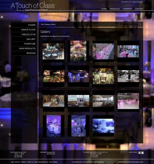
- Gallery page
The special part on this store is, that it actually does not sell anything. Customers can add products to their wish list and enquire for a specific date.
To achieve this, we disabled the display of any prices and we “masked” the checkout process by renaming a couple of elements, pages and buttons, by reducing the necessary fields for the account creation and by bypassing the checkout shipping and checkout payment pages.
Doing it that way – instead of installing any of the available “add ons” – ensured a minimal change of the core code, the store can easily be turned into a “normal” selling store any time.
We also added a event date chooser to the checkout confirmation page, so people can select the date of their event.
Finally, we created a gallery page, where previous events are showcased. The modification pull images from a specific banner group and display them on a special gallery page, all images open in a nice fancybox pop up.
Looking at the product information page, you will notice that the buttons section align always at the bottom of the page, same level as the bottom edge of the images, that look much nicer than to have them at the end of the descriptor or as a separate row
Take a look at the store, we hope you’ll like it: Visit the store online

