 Lure Factors is the specialist supplier of soft plastic lure making materials, based in the United Kingdom! If you have ever wanted to design and make your own soft plastic fishing lures but have been unable to find the materials available in the UK, then this is the right place for you
This is the first store going “live” with the new MTS version and is using a responsive template. The store is based on osCommerce 2.3.4 and has MTS version 1.5.0 installed on top.
All we had to do to get it responsive was, to enable the responsive template: 1 click ![]()
The store was designed completely in the administration panel, there are just a few lines of custom css for detail adjustments
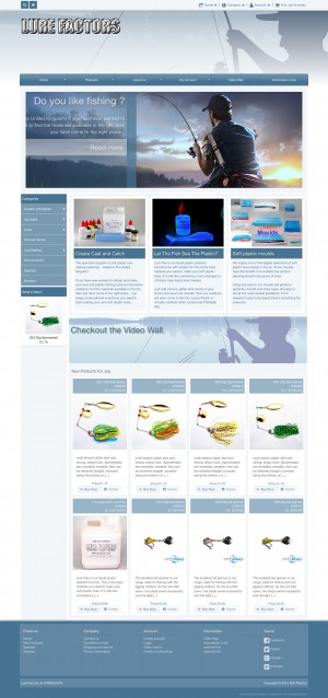
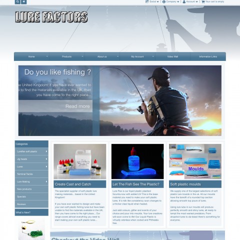
The front page consist of 3 banner modules and the new products module.
The first banner module display a large banner with a short introduction text, to let people know what the store is about. To get the nice sliding effect, you just have to set the text display to “captions” in the banner module settings
The second banner module display 3 banners in grid mode, each banner is linking to one of the most important store categories. If you like that display way, you can set the text display to “image and text” and the image position to be on “top”
You’ll notice that in smaller screens, the number of banners displayed may be 2 or 3. This is because we set he module to display “complete rows” only and avoid “orphan rows” with just a single banner (you can resize your browser window to see the behaviour)
The third banner is setup similar to the first one, the text display as a caption over the image, difference to the first banner is, that the caption position is set to “100”, so it is always over the image
Thant are just few of the possible banner configuration options
The new products display in a simple but nice grid, the “complete rows” setting is enabled as well
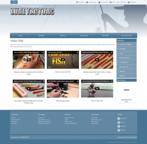
If you click on the 3rd banner, you’ll get to the “video wall” page. This is a custom made page that display videos, the page is responsive of course, you can see the videos resizing nicely. The video wall page is setup using the new MTS banner manager configuration is done completely in admin
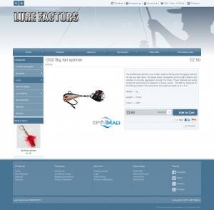
The product information page is kept simple, and behave very nice in smaller screens, completely responsive
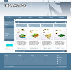
The product listing page use the new product listing module, you can switch from “grid” to “list” mode. The module switch automatically to “grid” mode for smaller screens, and restore automatically if the screen get bigger again. There is no “complete rows” setting of course, since we want all products to display
We hope that you like the store, please check it out here

