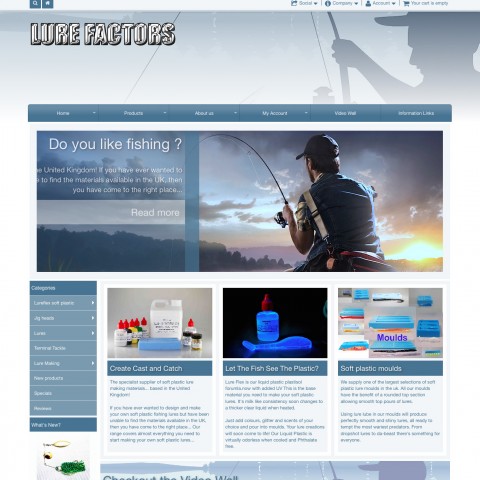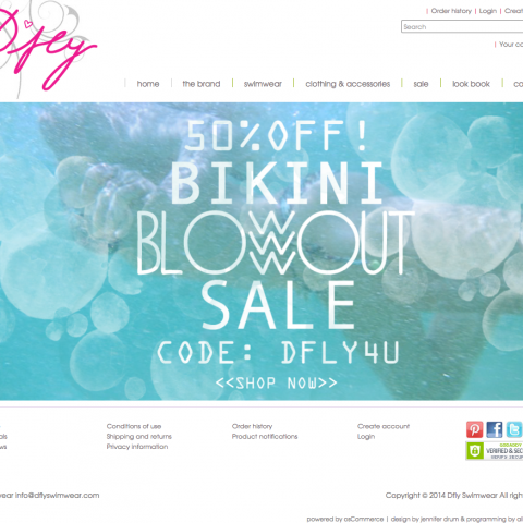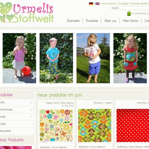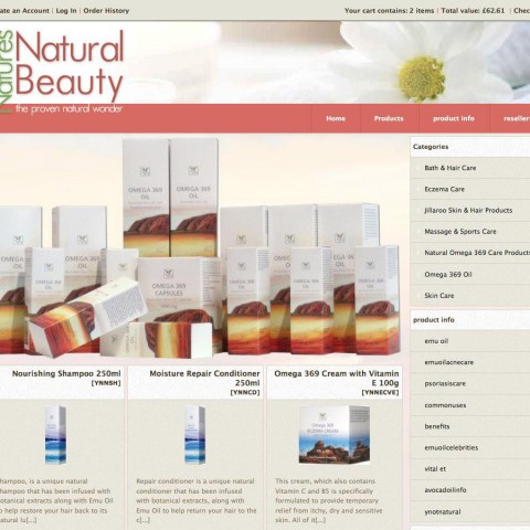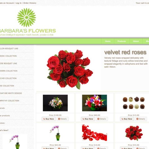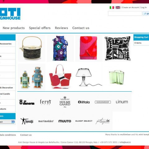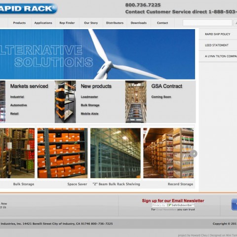
 Bakeria let you dive into the sweet world of cakes, cupcakes, fontant and marzipan. Baking is art and Bakeria has everything you need to create your own sweet artworks.
Bakeria.ch is the first store that goes online using page profiles, a system to create individual layouts for every single page of your online store. “Page profiles” got introduced with version 1.4 of mini template system.
Setup and configuration is done by the mini template system team. The great images got all provided by the store owner. Addons added are a Url rewrite tool (USU5), a couple of security improvements, a custom payment module and some smaller modifications, like a quatity input box on the product information page etc. The store has also mailbeez installed, this is a powerful email marketing tool included by default in all mini template system stores.
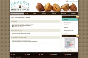
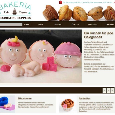
The store design is all done in the administration panel. Only manual changes are some extra css lines, like for example to add the nice cupcakes to the main navigation and the boxes, and some modifications at the footer. Worth to mention is, that no core osCommerce files have been modified at all for design purposes.
The store use color scheme “light beige”, shadow scheme “23_b” and has a custom ui-theme, created online using themeroler. The main color is dark brown, secondary color is a green-turquoise. Colors have been set matching to the store logo
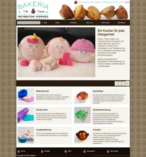
The front page is setup using the front page manager and include 2 banner modules: The first banner module shows a nice slideshow, all cakes and sweets are done by the store owner her self. The second banner module show the stores main categories in grid mode. For each category there is an image on the left and a short description on the right. The setup is done completely in the administration panel. The result is very clean and still very informative front page, letting store visitors know immediately what the store is about.
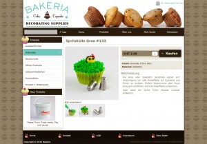
The columns have been removed from the front page only. On other pages, like the product information page – that has a very nice and exposed “add to cart button, all styled in css – or the product listing pages the left column include a supefish fly out categories box and the new products box.
A different setup is done for the contact us page and all information pages, where the column moved to the right and the menu display links to related pages instead of products and categories. On the “account pages“, such as the account overview or the order history etc, the navigation menu display links to any other related pages, again on the right.
This is all very easy to setup and configure using page profiles, it all depends on your needs, there are no technical skills required at all and of course it can be changed any time easily.
Bakeria is a Swiss store from Zurich.

