Here you will learn to configure front page modules that contain products. Available modules are: New products, specials and bestsellers.
The settings are same for all modules, except some small differences regarding the displayed content, that are explained separately. You can install a front page product module in the same way like all other front page modules
Configure the front page product modules
Configuring the front page banners mean to make decisions about the content, about the layout and about the various options for text size and color, backgrounds borders etc.
- front page products – general settings
- front page products – module content
- front page products – basic setup
- front page products – slider settings
- front page products – boxes content
- front page products – container settings
- front page products – module title settings
- front page products – boxes settings
To start with the front page banners configuration please press on “edit” on the right hand panel for the banner module you want to configure
General Settings
Following settings are available:
- Enable the module: You can enable or disable the module. Disabling mean that it won’t display anywhere, any settings you did will be saved
- General display: “yes” mean that the module will display on the front page unless there is an other setting via page profiles. “no” mean that the module won’t display unless there is a setting in page profiles.
- Module position: There are 3 possible positions available: (1) Full width on top or bottom of the page, or within the content area
- Sort order: Set the sort order of the module on the screen in relation to other modules of the same group. If, for example, you set the module to display on top and full width, the sort order will be compared to the sort order of any other modules with the same placement. If you set it to display in “content” it will be sorted in comparison to the other front page modules with the same placement
- Display the module title: select the if you want to display the module title, this is the text displaying eg “new products for May”. You can switch this on or off as per your needs. In case you decide to display it, you’ll have many configuration options available
Please note, that you can set the sort order, the position or enable/disable the module individually for any front page profile you have, using page profiles
Content
The content of each module depends on the module it self:
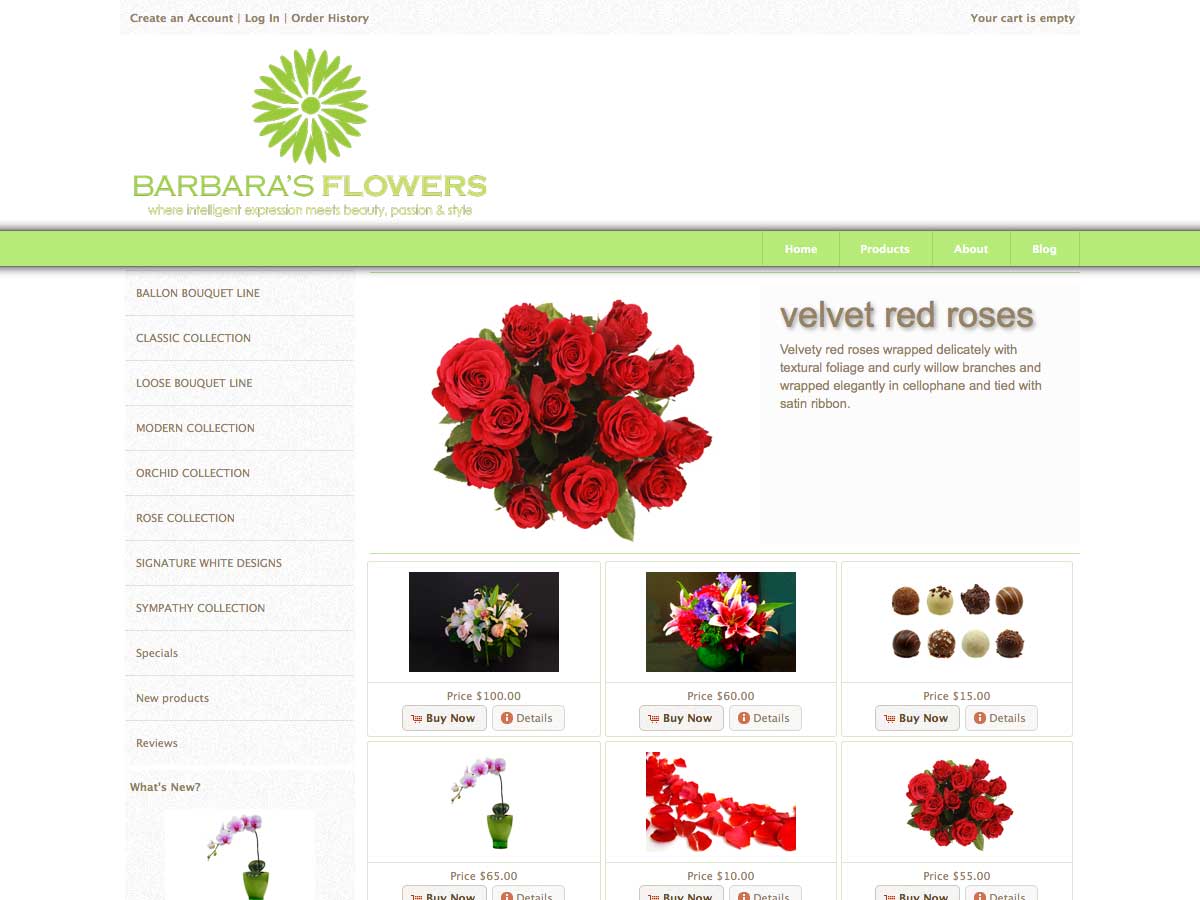
- The “new products” module will display the latest products added to your store
- The “specials” module will display your stores specials (you can set this in your admin panel under catalog>specials)
- The “bestsellers” module will display your best selling products in reverse order of the quantities sold
What you can do when configuring the module is, to select the category the displayed products should be pulled from. So you can for example say that you want to display new products of category “hardware” or specials of category “dvd movies” Please note that, in case you select a main category that has subcategories but no direct products added to it, all products of all related subcategories will be added to the selection. In case you select a (sub) category that has products added directly to it, that products will be used for the selection


Set a sort order for the module and press on “save” and go to your store to see the result. You wll see the selected products on your front page

Basic setup
You can make following decisions
- Display mode: You can select if you want the product boxes to be displayed as a slider as a grid or in default mode. Selecting “grid” you will get a static display of boxes on the front page. You can configure the content of the boxes in the next steps. Selecting “slider” you will get the same boxes in a horizontal slider. Selecting “default” you will get a the default osCommerce way of listing, but you will be still able to do some configuration settings to this too.
- Respect margins: Here you can decide if you want the module to respect the store margins or to expand till the edge of the available store width. Setting this to “yes” the module will adjust within the content margins. Setting it to “no” the module will occupy the full available width
- Number of products: This is the total number of products to be displayed. You can have for example 50 special products, if you set this number to 6, only the first 6 products will be dispayed
- Products per row: In case of a display as a “grid” or in “default” mode the number set the products per row. After this number is reached, and if there are still more banners to display, a new row will start. In case of a display as a “slider” the number set the the product boxes to be displayed at the same time on the screen. So you can select for example to display your products in sets of 3
- Not enough products: Here you can decide what to do with the module in case the total available products are less that the selected products per row. If you select for example to display 4 specials per row, but you have only 3 specials products set. Available settings are “hide” and “display”.
Slider settings
Slider settings are same for all front page modules, please check the section slider settings for details. Please note that any settings in this section are relevant only in case you selected “slider” as a display mode
Product boxes content
Next set of settings you can do are about the content of each product box, in other words you can decide why kind of information you want to display for each product. Please note that following settings are valid only in case of a “grid” or “slider” display. In case you choose the “default” osCommerce mode, the module will display the products image, products name and products price
- Display products name: Select if you want to display the products name
- Display products model: Select if you want to display the products model
- Display products manufacturer: Select if you want to display the products manufacturer. In case of yes, the displayed manufacturer name will be a link to all products of this manufacturer i your store
- Display products image: Select if you want to display the products image. The image size is same as the “small image size” used for all product listings. You can set this in your administration panel under configuration > images
- Display products description: Select if you want to display the products description
- Description length: You can set how many characters of the product description do you want to display.
- Display products price: Select if you want to display the products price
- Display products quantity: Select if you want to display the quantity you have in stock
- Display offer expiration date: (specials only) Select if you want to display the expirration date of the offer
- Display date added: (new products only) Select if you want to display the date the product was added to your store
- Display number of sales: (bestsellers only) Select if you want to display the total number of products sold
- Display “buy now” button: Select if you want to display the “buy now” button. Pressing this, the product will be added to the customers cart, in case it has no options. If it has, the button behaves as a link to the product information page
- Display “details” button: Select if you want to display the “details” button,that will link to the product information page.
Container settings
Next set of settings you can do are about the design and layout of the container that hold the product boxes. Settings will apply in both cases of display, as a grid as a slider or in default mode
- Container padding: This is the top and bottom padding of the container that holds the product boxes. You can enter any value in pixels
- Container background: This is the background color of the container that holds the product boxes. You can select any color intuitively, using the colorpicker
- Container border: Select if you want a border for the container that holds the product boxes. You can select top border, bottom border, top and bottom, or a border all around
- Container border thickness: You can set the border thickness in pixels
- Container border color: You can select the border color using the colorpicker or by entering the hex value without # in front (eg ff0000 for red)
Module title
In case you decided to display the module title, you have following configuration options available:
- Module title text size: Enter any size you want in pixels
- Module heading alignment: You can set the alignment to left or right. The option to align center will come in version 1.4.2
- Module title vertical padding: Set the vertical padding of the module title in pixels
- Module title horizontal padding: Set the horizontal padding of the module title in pixels
- Bottom margin of module title: Set the distance of the module title to the module content
- Title text color: Select the text color using the colorpicker or by entering the hex value without # in front (eg ff0000 for red)
- Title background color: Select the background color using the colorpicker or by entering the hex value without # in front (eg ff0000 for red)
- Title border: Select the border for the module title. Following options are available: top, bottom, left, right or a border all around
- Title border thickness: The thickness of the module title border in pixels
- Title border color: The color of the module title border
Boxes settings
Next set of settings you can do are about the design and layout of the product boxes. Settings will apply in both cases of display, as a grid or as a slider, but not in case of the “default” display
- Basic style: Here you can select if you want the style of the listing to be based on the themeroller theme or the css color scheme. In any case you will be able to change any of the default settings below. Leaving the below settings empty mean that the default values, depending on your selection here, will be used
- Box heading text align: You can align the box heading to the left, to the right, or place it to the center of the box
- Boxes margin: This is the distance of the boxes to each other in pixels. You can enter any value.
- Equal margin: This setting will use the same margin that you have between the boxes also for the distance of the boxes to the edge of the container. Say for example, you have 3 boxes in grid mode and set a margin between them of 10 pixels. Till now the result was that the boxes will have a distance of 10 pixels from the container edge but 20 pixels between them. Using the new setting you can have an equal margin of 20 pixels
- Boxes border: Select if you want the product boxes to have a border. Please note that if you use “ui widget” as a basic style, there will be most likely a border coming from the selected ui theme. The border you add here will be an additional border
- Boxes border thickness: The thickness of the product boxes border in pixels
- Boxes border color: The color of the product boxes border
- Boxes border hover color: The color of the product boxes border upon hover
- Boxes heading background color: This is the background color of the box headers, you can select ay color using the color picker
- Boxes content background color: This is the background color of the box body
- Boxes footer background color: This is the background color of the box footer area.
- Boxes footer border color: This is the color of the thin line that peparates the box body from the box footer. If you don’t want any line there, you can set this color same as the body or the footer background color
- Boxes heading text color: This is the text and link color of the box header
- Boxes content text color: This is the text and link color of the box content
- Boxes footer text color: This is the text and link color of the box footer. The text color of the buttons get not affected by your choice here