A clearly structured but also complete navigation is a very important part of your websites design and setup: It helps visitors and your content not to get lost. A good way to set up a navigation system is to use a horizontal navigation bar in the header of your website, visible all the time. osCommerce has by default not any navigation bar. Mini template system includes since version 1.2 a powerful tool:The menu maker You will learn here how to use the menu maker to create and configure your main navigation bar
Install the main navigation bar
First step is to install the navigation bar. That’s an easy process, all you have to do is to go to the mini template system area of your administration panel, click on “elements” and then click the “install” button in the top right corner of the page. Choose “main navigation” and then click “install” again.


Please make sure that before doing this, you have the link manager already installed
After the navigation bar is correctly installed, you can start to configure it.
Configure the main navigation bar
Configuring the main navigation bar means to make decisions about the content, about the layout and finally about the text and background colors.
- main navigation bar – create the menu
- main navigation bar – show products
- main navigation bar – top level layout
- main navigation bar – sub level layout
- main navigation bar – set up the colors for top level
- main navigation bar – set up the colors for sub levels
To start with the navigation bar configuration please press on “edit” on the right hand panel
Main navigation: create the menu
Fist thing is to decide about the content of the navigation bar. You can use any of the link groups you have already created using the link manager or you can create a new one. Link groups are like menus, so creating a link group is like creating a menu. You can read here about how to create a new link group
In this setup example we are going to use the link group “main navigation”. That means that all contents of this group will be the contents of the main navigation bar. The top level sub groups of link group “main navigation” will be the main tabs of the navigation menu

To set a link group for the main navigation bar, simply select it from the drop down menu

Press on “save” and go to your store to see the result

You can display of course any link group you like. You can for example choose to display your product categories, in this case you need to select the link group that contain the product categories, that is the link group called “products”

In this example we have the top level categories in the menu. We could have any other product category, or products directly, this depends on the contents of the link group we want to display. If for example you want to display the contents of product category “DVD movies” in your main navigation bar, then you need to go on as follows:
- Create a one link group: You can call this group as you like, it has not to be “DVD movies”, let’s call it “new link group”
- Add the category: Here you go and select the category “DVD movies” to be the content of the new link group. You can add any other links too
- Select the new group: Go back to “elements -> main navigation” and select the new created category to be the content of your main navigation bar, in the same way you selected “main navigation” or “products” just before


In case the group has no sub groups, then the links of that group will be the contents of your main navigation bar, for example for link group “osCommerce”

Main navigation: show products
In case your main navigation bar shows product categories, you can decide if you want the products themselves to be shown too or not
It doesn’t matter what level of product categories you decided to show (eg the complete category tree or just a particular category) or on what menu level you decided to show them (eg on the top level of the navigation bar or as part of a sub menu)
The decision depends mainly on the number of your products. If you have many products, that could lead to very large menu drop downs or fly outs and this could be confusing.
You can turn the setting to “yes” or “no” as per your needs
Main navigation: top level layout
You can configure the lay out of your main navigation bar, making decisions about following:
- Show search: Choose if you want to show the search input field in the header. You can set the setting to “yes” or “no”
- Search position: In case you decided to show the search in the header you can choose if you want it to be positioned on the left or right of the navigation bar.
- Height of navigation bar: You can have a very thin or a very thick navigation bar, this setting depend absolutely on your design needs
- Automatic width of top menu items: You can decide if you want the width of the top level menu items to be set automatically. In case of yes all items will have the same width and the menu will fill all the available space to 100%. This is recommended if the text of your top level menu items is about equal. In case of no you can do manual settings below. Manual settings will let you to host very long and very short menu items on the same menu without any problems
- Manual width of top menu items: Use this setting if you decided not to use the “auto width” option. Here you can set a left-right padding for the top level menu items. Their with will adjust to their content, that means that long menu tabs will be larger than short menu tabs.
- Menu position: If you decided to set the width of the top level menu tabs manually, it can happen, or it can be your intention, that the menu does not fill all the available space to 100%. Here you can set if you want the menu to be on the left or right of the navigation bar
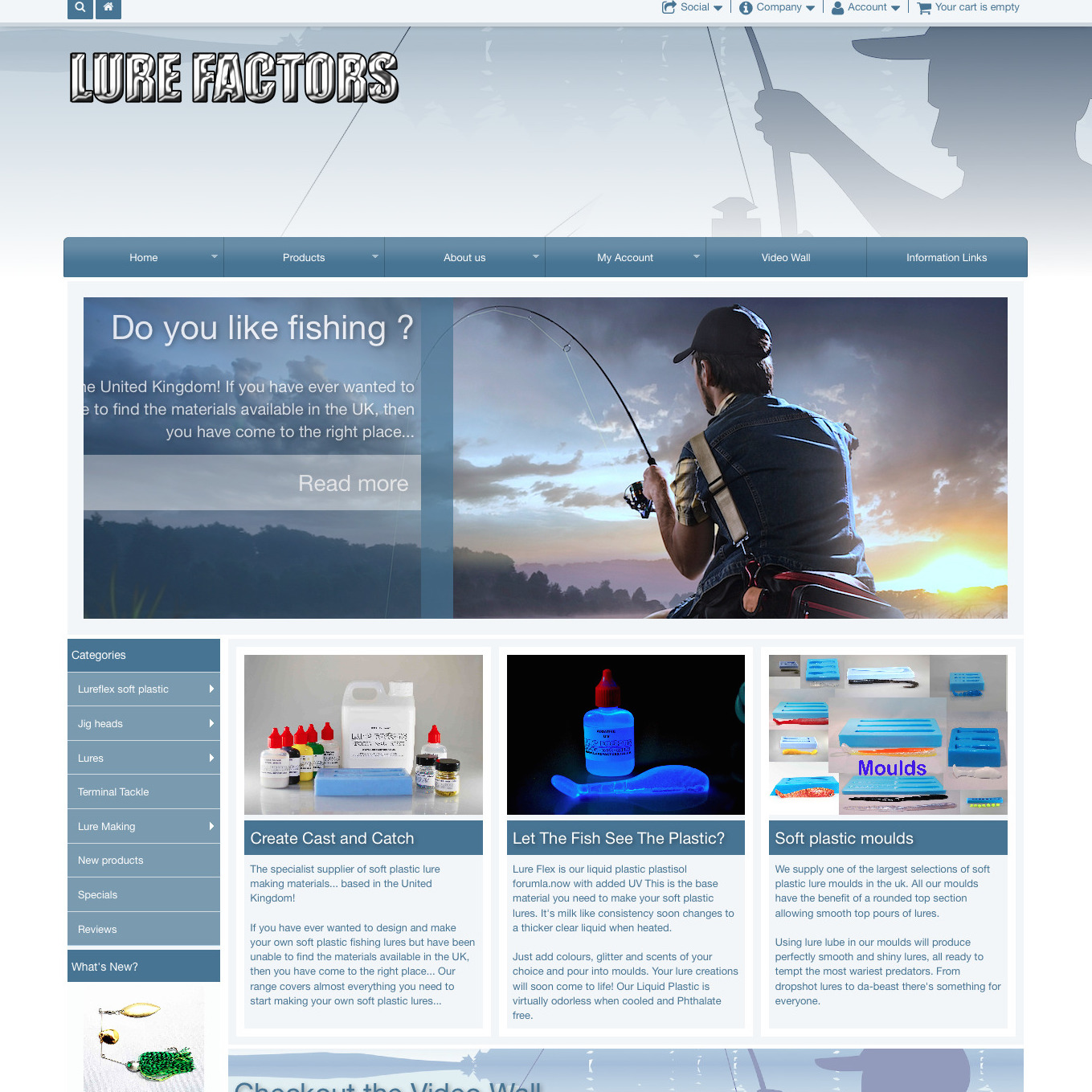
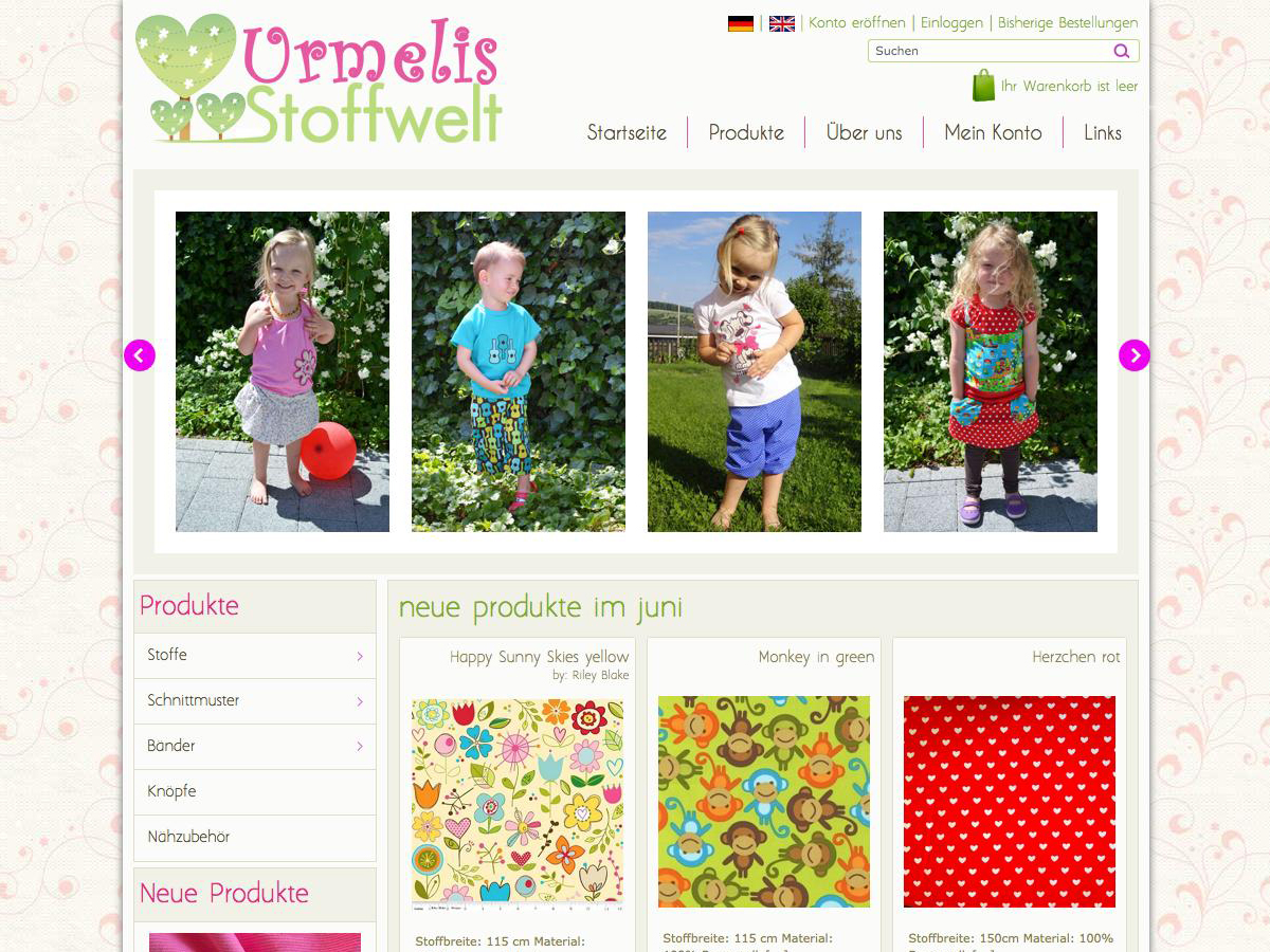
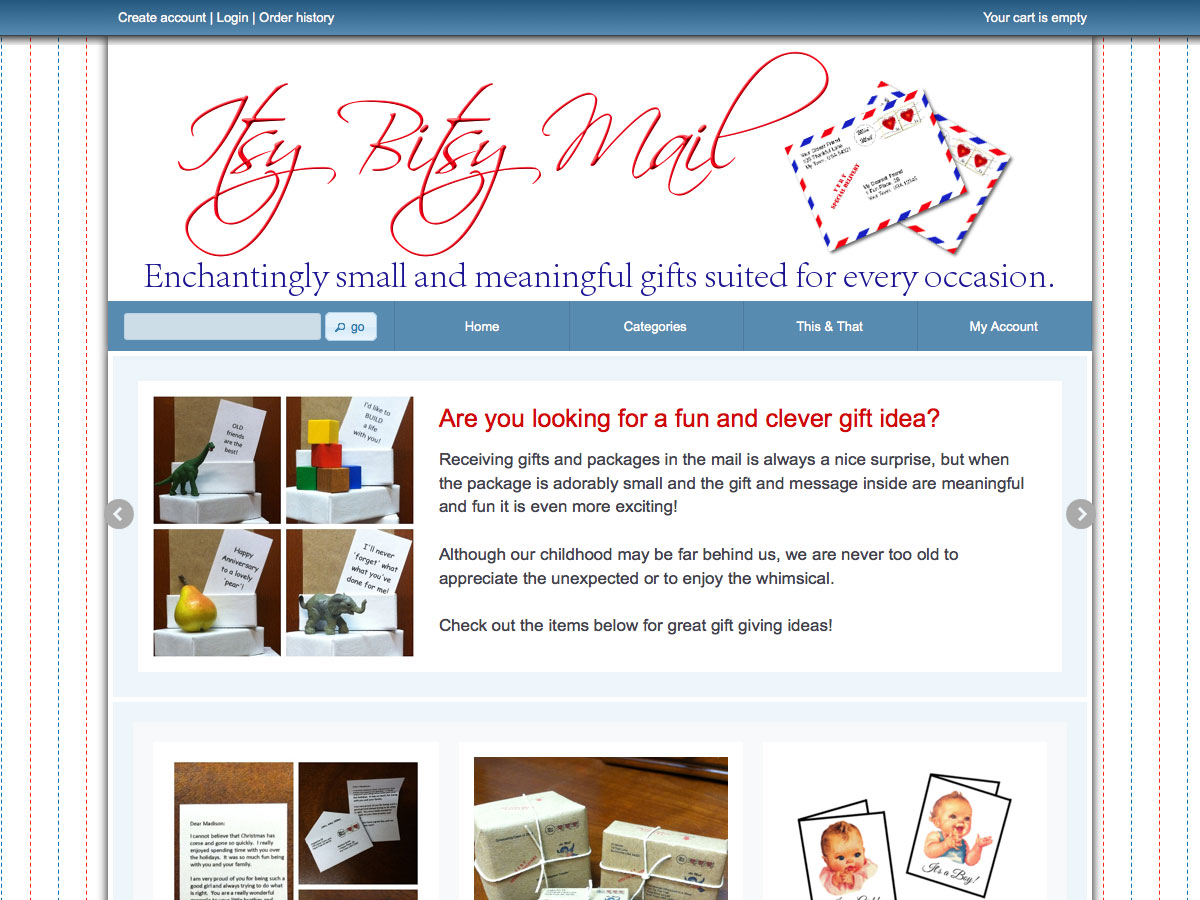
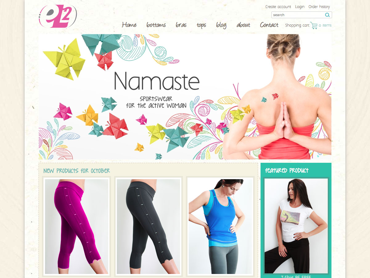
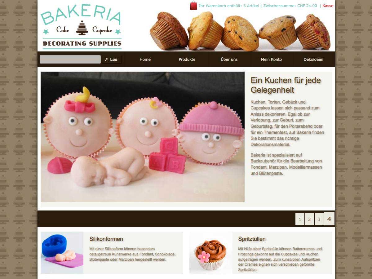
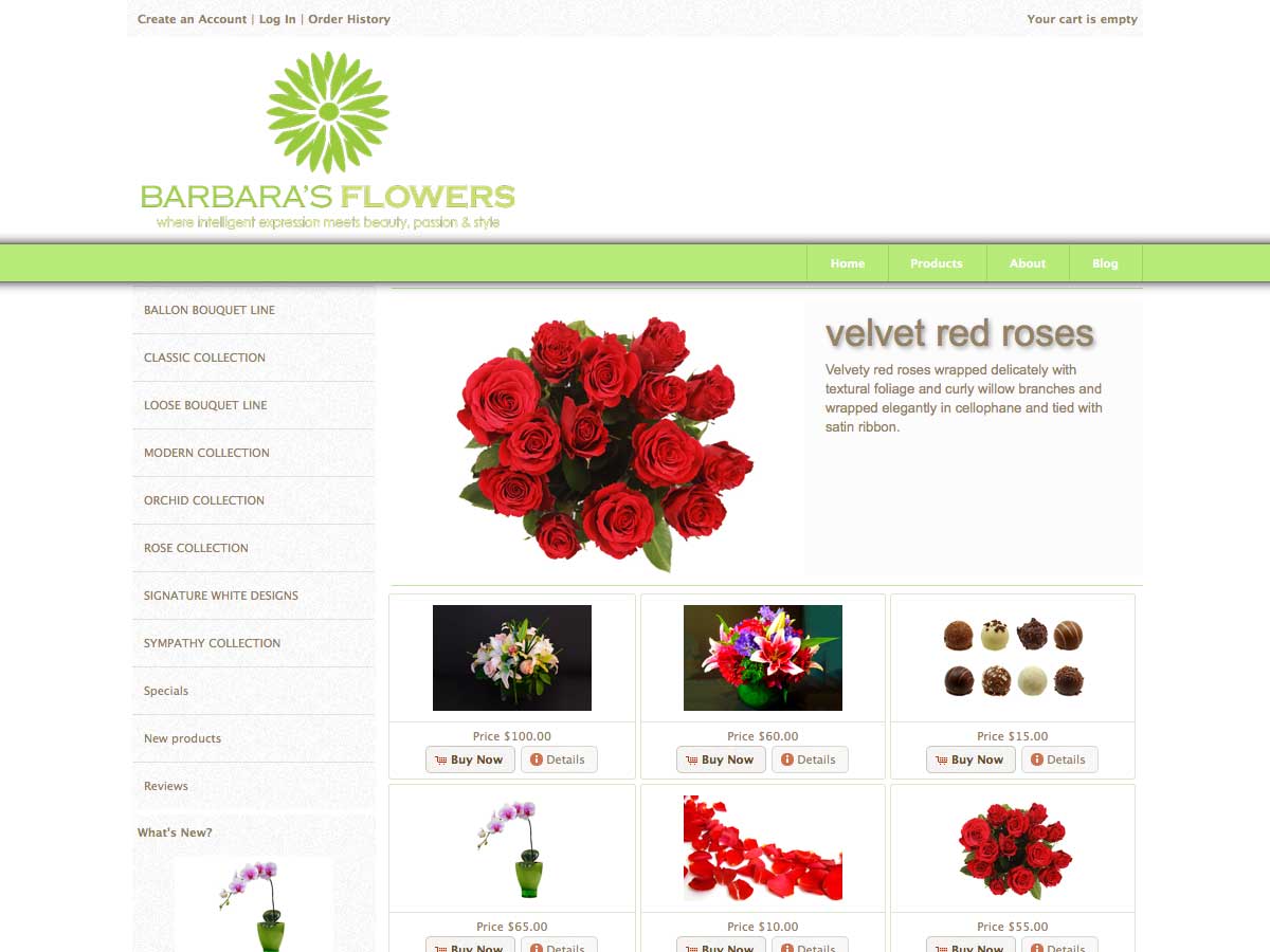
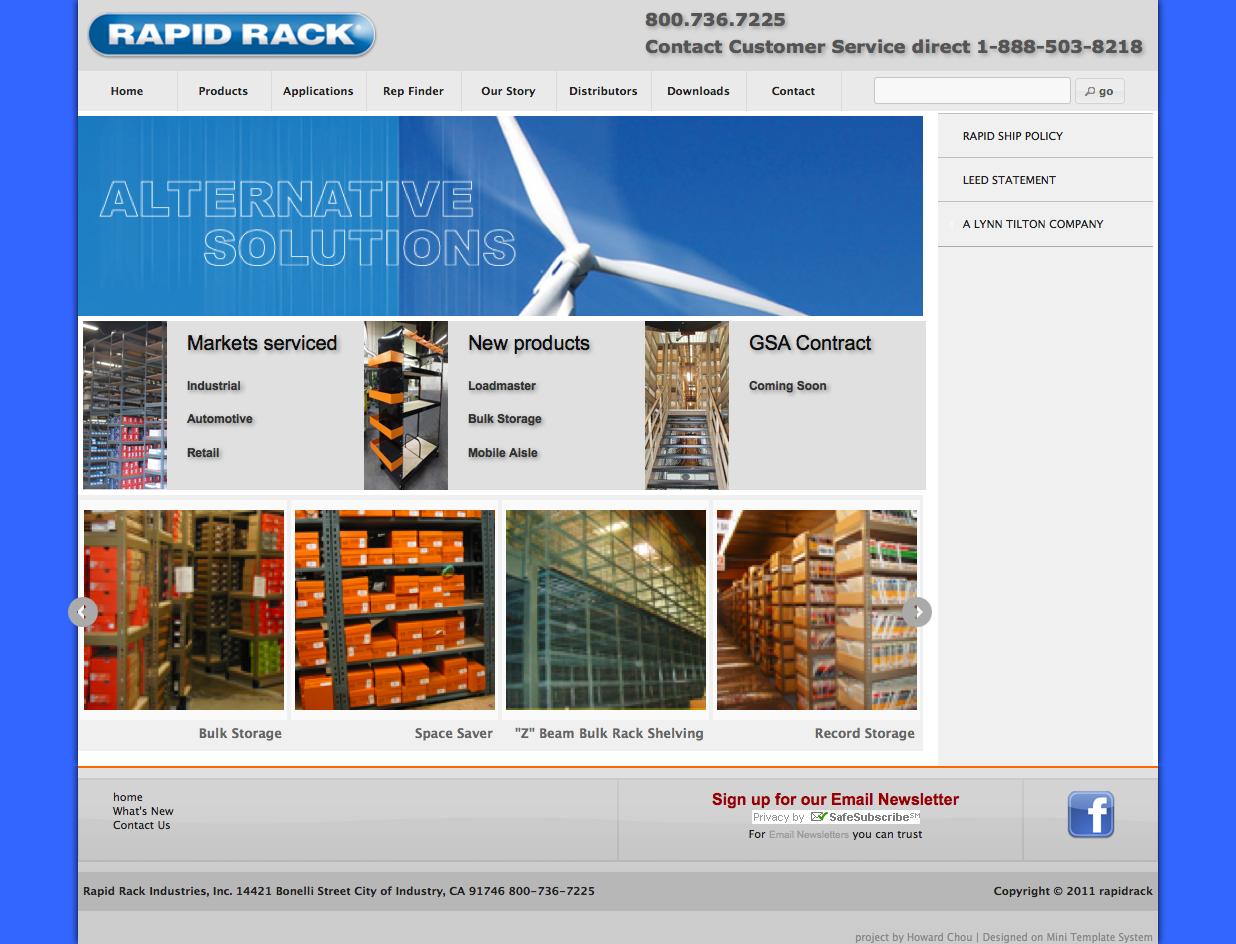
Using this settings will give you a very large spectrum of unique lay outs for your main navigation bar. Here are some examples:


Main navigation: sub level lay out
The lay out of the sub levels of your menu is the same important as the top level. Here you have also various options to create a unique set up according to your needs
- Use supersubs: “Supersubs” is a superfish addon that let the width of the menu tabs to adjust to the length of it’s content. If you set the setting to “yes”, the width of the submenus will adjust to the content of the menu rows (limited by your settings below). If no, the menu width will be same as the top level items, that means that a very long top level tab will have very log sub tabs also and opposite. In this case long text may fold
- Maximum width: In case you use the supersubs option, here you can set the maximum width of the sub menu tabs. Default is 25 em
- Minimum width: In case you use the supersubs option, here you can set the minimum width of the sub menu tabs. Default is 15 em
- Height of the sub menu tabs: The height of the sub menu tabs can be set independent of the the heigh of the top level. Default is 1.5 em, but you can set any height that fit your needs


Main navigation: colors on top level
Custom colors will give the “final touch” to your navigation bar. There are various settings available. Any colors can be set either by typing in the hex code (eg #FF0000 for red) or by selecting them intuitively using the in build color picker
- Top level default background color: Here you can set a custom background color for the navigation bar on top level. If you don’t set anything the colors of the themeroller theme in use will be used
- Top level hover backround color: Here you can decide about the background color of the top level menu items when hovering over them. If you leave this field empty, a semi transparent color of the chosen color scheme will be used
- Top level border color: Here you can set the color of the borders that separate each menu tab from the next one. If you leave this field empty, a semi transparent color of the chosen color scheme will be used
- Top level text color: Here you can set a custom text color for the menu items on top level. If you don’t set anything the text color of the themeroller theme in use will be used
- Top level hover text color: Here you can set a custom text color for the menu items on top level when hovering over them
Main navigation: colors on sub level
Custom colors can also be set for the sub levels of your navigation menu. There are various settings available. Any colors can be set either by typing in the hex code (eg #FF0000 for red) or by selecting them intuitively using the in build color picker
- Sub level default background color: Here you can set a custom background color for the drop down menu items. Default is the color of the chosen themeroller that is used as a background for the side boxes
- Background color for active parent category: This is the background color you want to use to highlight the parent category of the category the user is on. This setting takes effect only in case of product categories.
- Background color for active link: This is the background color you want to use to highlight the active link
- Sub level hover backround color: Here you can decide about the background color of the sub level menu items when hovering over them. If you leave this field empty, a semi transparent color of the chosen color scheme will be used
- Sub level text color: This is the color for the menu items on drop down level. If you don’t set anything the text color for the boxes of the themeroller theme in use will be used
- Text color for active parent category: This is the text color you want to use to highlight the parent category of the category the user is on. This setting takes effect only in case of product categories.
- Text color for active link: This is the text color you want to use to highlight the active link
- Sub level hover text color: Here you can set a custom text color for the menu items on sub level when hovering over them
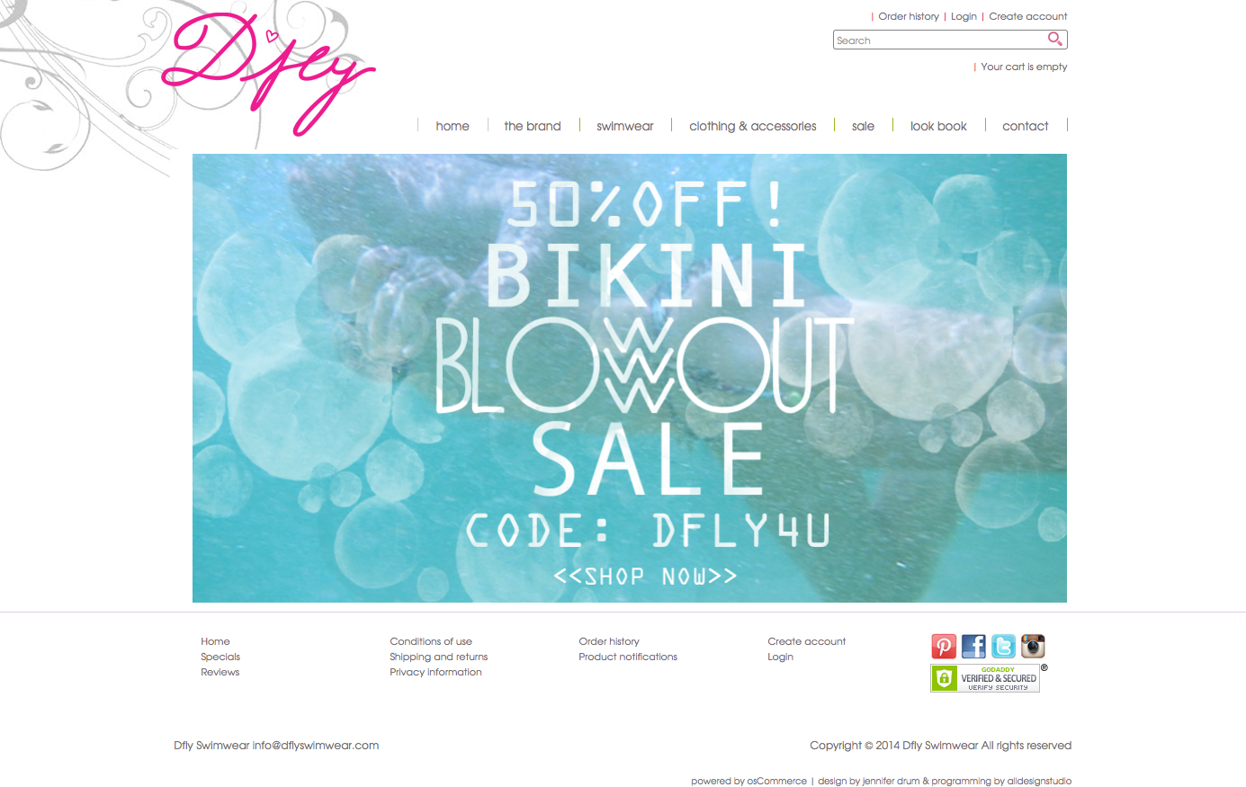
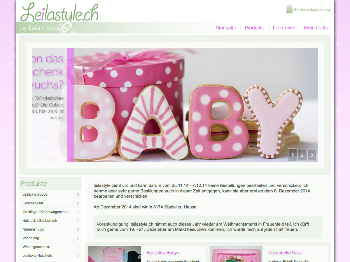
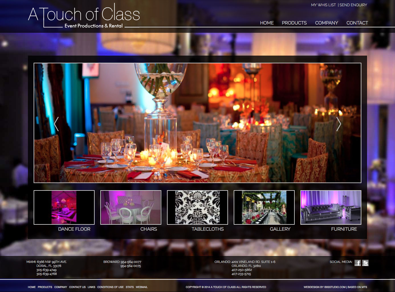
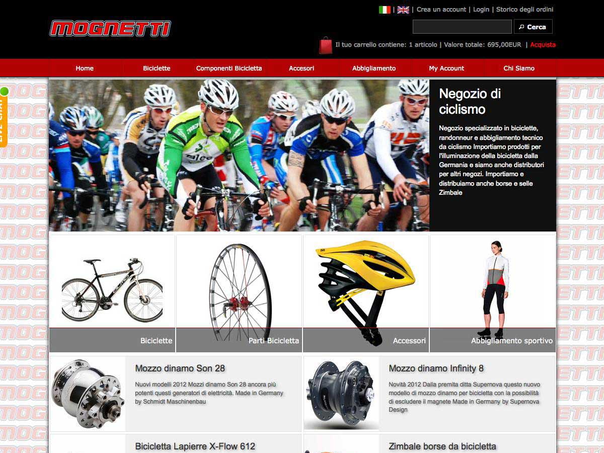
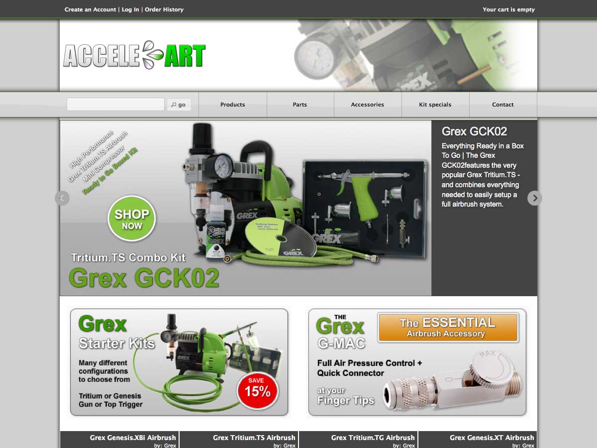
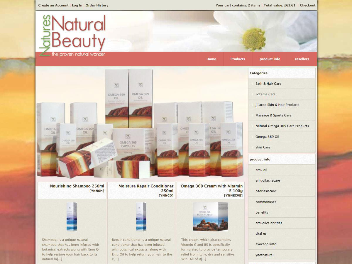
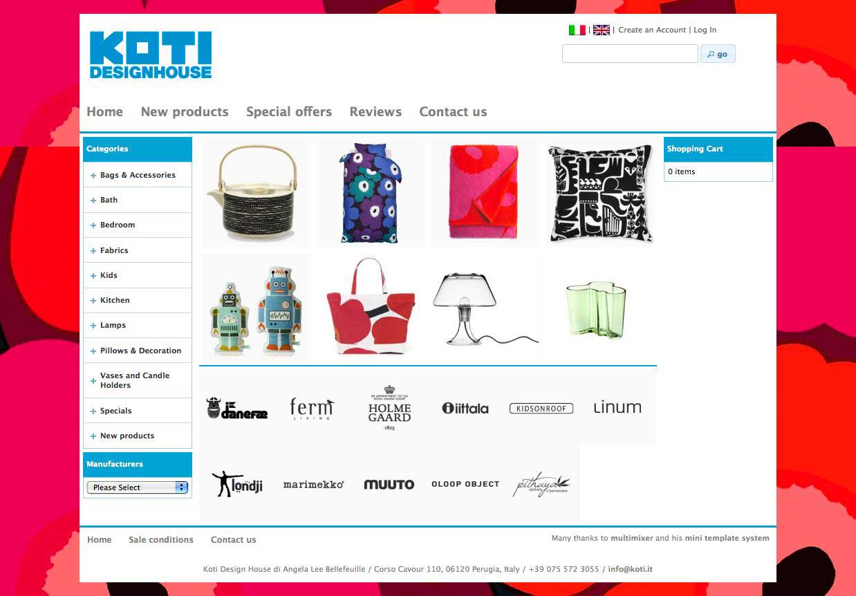
Here are some more examples of customized navigation bars using various settings. You can do this all in your administration panel and configure your main navigation bar completelly as you like