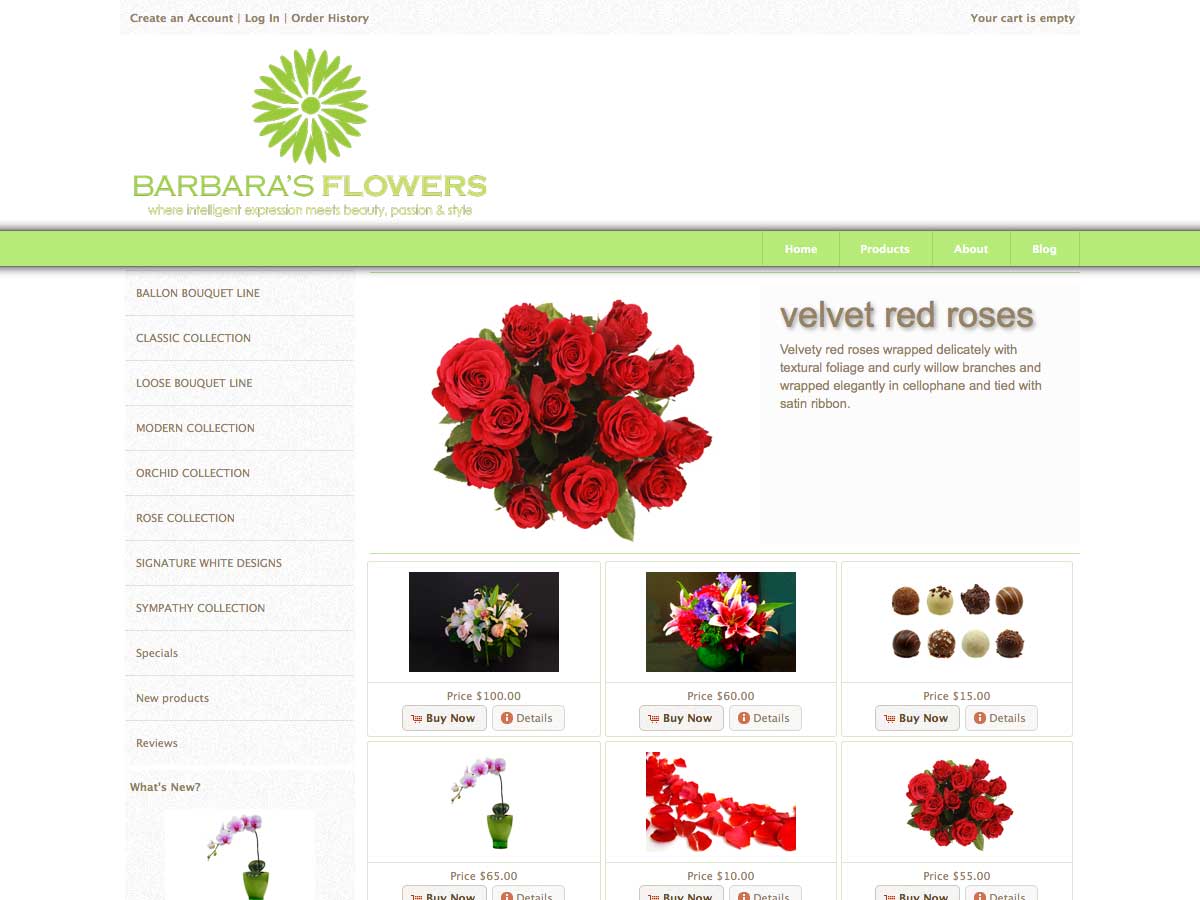
Mognetti bike is a store dedicated to eveyone who shares the passion for cycling. The store specializes in bicycles, cycling technical apparel and cycling accessories, all of which have been tested by the owner himself and his travel companions .
The store is based on osCommerce version 2.3.1 and mini template system version 1.4
Francesco, the owner and dedicated biker, came to us with a store already altered by various addons and other modifications, some of them installed by himself, some other by other developers, some of them coverted to version 2.3.1, some others not really compatible. There was no documentation about the modifications done
What we did was, to check all files that display on the store side and make sure they don’t contain any outdated code. We also disabled – but not removed – addons that would become redundant because of mini template system, such as modular front page, a hardcoded image slider and others. No Problem at all was the magic zoom plus addon that create a very nice zoom effect on the product information page
Having a clean base we could start with the store design that happened to te biggest part in the administration panel, based exactly on the same template, like all other stores. Mini template system does not change any files for template purposes, like most of the other templates do, it’s all about settings. With one and only template you can get 1000’s of different looks
What we added, on top of the existing modifications, was USU 5 by FWR media – that is a system to get nicer urls – and our own modified version of QuantityPro – a system to track attribute quantities. We did also some smaller modifications, like a quatity input box on the product information page, a small modification to use the products url field for additional pdf information material etc. The store has also mailbeez installed, this is a powerful email marketing tool included by default in all mini template system stores.
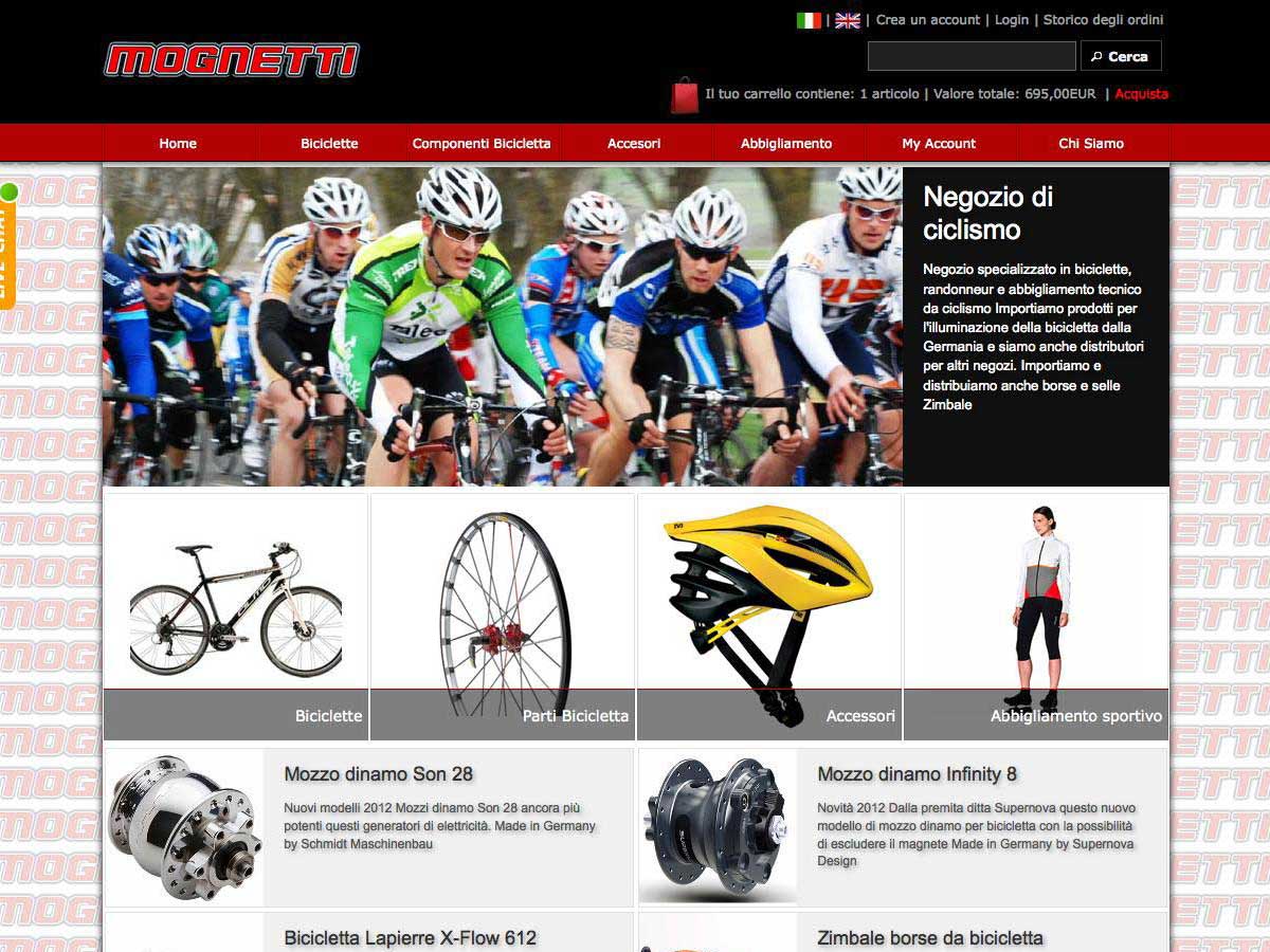
The store use color scheme “datk grey”, shadow scheme “21_a” and has a custom ui-theme, created online using themeroler. The main colors are a very dark, almost black, grey and a shade of red, a very strong contrast, but nice looking and matching the colors of the logo
The front page is setup using the front page manager and include 2 banner modules and the categories module: The first banner module shows a slideshow with text on the right of the image. After that the categories front page module, that is set to display the 4 top level categories. The categories name is on a transparent background showing an “exanding” effect upon hover, this is something that will be available in the next MTS versions, for now it is done with 2 lines of css. This is the only manual addition to the front page. The second banner module show some products and categories that need to be highlighted. The setup is in grid mode and the content is added via the MTS banner manager the stores main categories in grid mode. The setup is done completely in the administration panel.

The columns have been removed from the front page only, this was very easy to do using page profiles. If you visit the store you will see that column position and content is different depending on the page group you are on. This all happens in the administration panel, the configuration options are unlimited.
The product information page shows the various options (and stock status) right on top. After that a very exposed “add to cart” button. Next, the social bookmarks area and then the buttons for reviews and pdf link in case it exist.
The product description use an “accordion” style, each section has it’s own tab. There was no addon or any file modification necessary to achieve this
The product listing pages are in table mode and not in a grid. The reason for this was, that there are some categories with very few products, so the rows would look “orphan” having eg just 2 products in a grid layout that is meant for 3 products per row

An other page you could visit is the F.A.Q. page that has the same accordion effect as the product information page. Questions and answers can be added via admin and appear on the page in this manner.
A small little detail: The shopping bag in the header is grey if the cart is empty and get red if there is something, this way of highlighting the cart contents is worth the effort to remind people that they have something in their cart
Mognetti bike is an Italian Store from Brescia in Italy and use 2 languages, Italian and English
The store did it’s first sale 30 minutes after it was online. We are very happy about this and hope it is a good sign