Mini Template System version 1.5.0 released
We are happy no announce a new version of Mini Template System that got released today: Version 1.5.0.
This is a major mini template system upgrade, following is new:
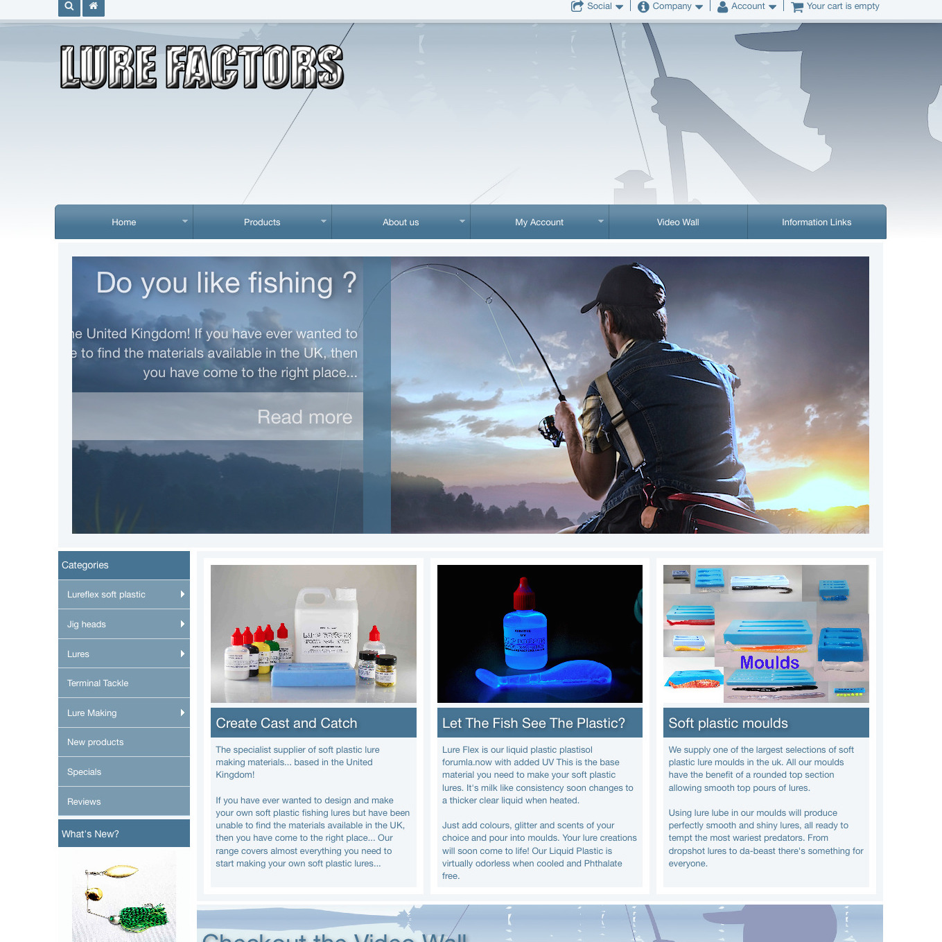
1) A new, great and fully responsive theme.
We are very happy and proud to release after really a lot of work, our responsive template.
Our development had 3 targets and we think that we achieved all of them
- compatibility with the existing osCommerce release, the existing add ons and the many users who use osCommerce 2.3.4 or already use MTS
- the highest possible grade of flexibility: We want you to decide yourself about the way your store look like and about how it should behave on various screen sizes
- the less possible core code changes
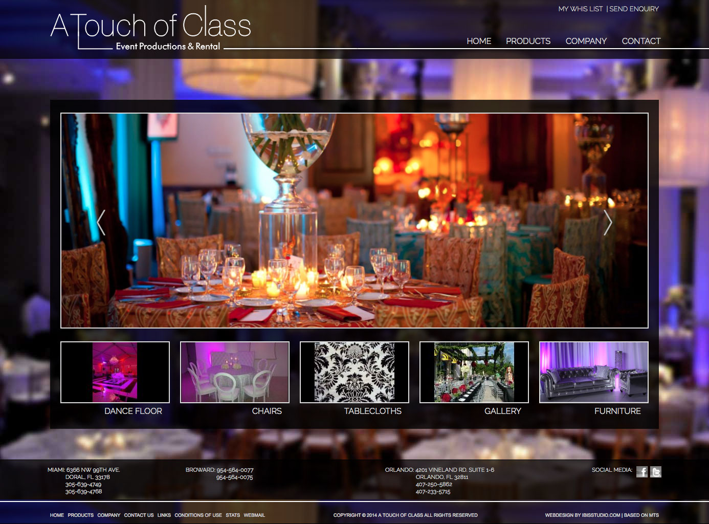
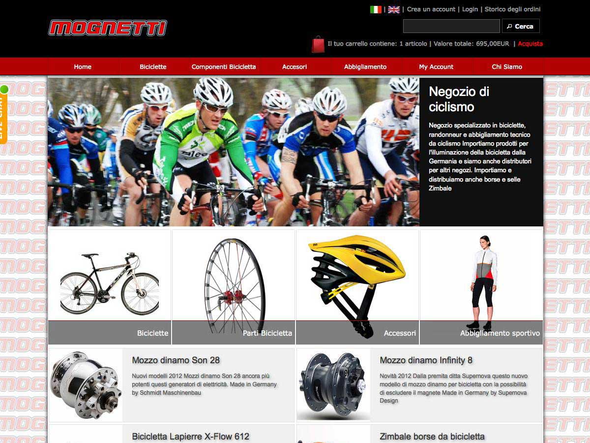
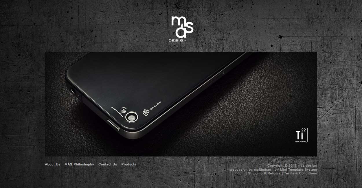
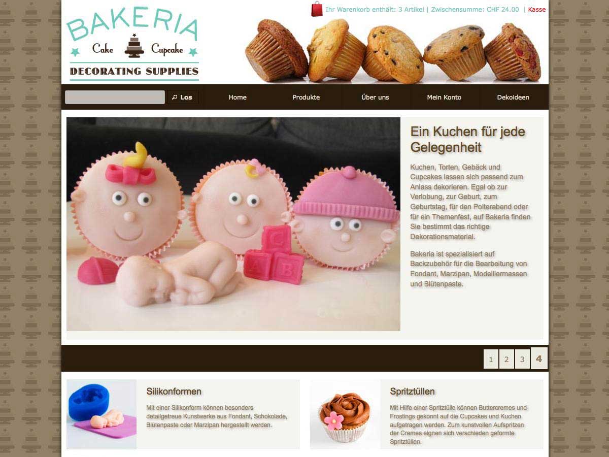
The new responsive template work on the current 2.3.4 osCommerce release (and any previous release of the 2.3 series) . There are no core code changes necessary in order to get it working – other than to install MTS itself of course, that is an easy task as many of you know
In other words, you can simply install MTS on any store of series 2.3 and have a responsive store that you can configure as you like
We are using LESS to transform the existing grid system into a responsive framework. The whole system is dynamic, in the meaning of accepting settings you do in your administration panel. So, for example, you can
- set the total store width your self or set it to full width of 100% of the screen
- set the breakpoints for the different screen sizes your self. You can set your self what e.g. a “medium” screen is, you don’t have to use 992 pixels or whatever
- decide your self about the layout for each breakpoint. So you can decide what to do with the columns for a small screen and do a different setting for a extta small screen. If you want to hide them, display left, right or under the body, that is your choice for each breakpoint.
- also decide about the behaviour of many modules. For example, you can set the breakpoint where the main navigation turn from expanded into a “hamburger” button your self. Similar settings are possible all over, we’ll update the usage instructions for more details
The LESS files are compiled and minified automatically into regular css files upon saving the settings
2) main template improvements
There is a whole new and long list of available settings for both, the new responsive or the existing static templates. You can control now almost every detail of the store, including header and footer colours (and responsive behaviour for responsive templates)
For example, you can set a “sticky” top bar, that will stay in place while you scroll down the page. Same you can have for the main navigation if you want. That “sticky” status accept different settings, so you can have a different colour or a different height if you want
What we want to point out are the “dynamic shadow settings”: Even shadows are not that much in fashion anymore, they are still a very good way for setting the overall page layout. So we made all shadows “dynamic”, in the meaning that they accept settings you do in your administration panel. For each shadow scheme, you can now select the shadow colour, the shadow intensity and the colour opacity. It is your choice to have a very strong or very light, even invisible shadow
We included the latest jQuery and jQueryUI versions and created a couple a new nice themes
3) Various improvements to all modules
All modules, including banners, product modules, menus, main navigation are responsive, in case of course you use a responsive template. There are breakpoint specific settings you can do, for example, you can set the maximum and minimum items per row for any product or banner module, you can decide if you want to allow “orphan” rows or not and much more.
There are also automated adjustments where you don’t have to worry about: For example, in case a super fish fly out menu has to display under the main body in a small screen, it turn itself automatically into a accordion menu – a “fly out” wouldn’t make a sense of course on small screens
Beside that, there are many new settings and small improvements done, for example:
- For the product modules, you can now set a different image size for each of the modules that display products, you can set the display order and of course do a lot more design settings, shadows, border, opacity of colours and much more
- For the fly out menus, there is now a “hover intent” script preventing the menu to expand “by accident”: It expand only after the mouse rest for a short while over the menu tab. If you wish you can set the menu to act only “on click”. There are separate colour settings for top and flight level, you can even set the colour of the arrows that indicate deeper levels in the menu
- For banner modules, beside all other improvements to the banner manager itself, there is a whole new list of settings you can do for each banner module, including colours, shadows, coption manipulation etc etc. Additional, there is a unique id added to each of them, that allow a very specific individual styling for each banner via css in case you need that
4) Banner manager
We did a complete rework for our banner manager.
Multilingual banners: this was a request of many MTS users who have multilingual stores. You can now upload a separate image for each of the store languages and of course add a different banner text for each language.
The language specific image is optional: You can skip it, in that case the system use the default banner image. That way you can upload additional language specific images only for banners where you need it, for example banners that contain a text as part of the image
Banner link: Additional to what you could do till now, link the entire banner to a url, you can now create a link or button as part of the banner body. You can set the link target as you like, name the link (or button) as you like individually per language and do various settings in the banner modules
New admin layout: A much nicer and much more organised admin page to help you setup your banners in a more efficient way
5) A new product listing module
This is a very nice and flexible module that will let you setup your product listing exactly the way you want it. The module allow a listing in “grid” or “list” mode, allowing a switch by the page visitor. For responsive templates, the module switch automatically to “grid” mode after a given screen size, this is the size where a “list” mode make no sense anymore. Also possible;e: Display your products in a slider mode
The grid/list switch is part of the product listing toolbar, that contain also a nice drop down for the sort order of the products.
The entire module is completely configurable, you can do settings for the whole area, for each product box, set any colours, shadows, borders etc, you can decide about the display way, decide about the information you want to display, set the image size etc etc. Even the toolbar or the pager can be designed down to the smallest detail
The module is also used on the new products page, the specials page and the advanced search results page
6) New module group for category pages.
You have now a special set of modules available for all pages that display subcategories: Available modules are:
- categories module
- new products module
- specials module
- bestsellers module available,
Each module display subcategories and products of that parent category. The configuration settings for each module are same as for the front page modules, the modules are responsive
7) New admin interface and improved functionality
Till now each setting for each module, had its own “row” in the sidebar. As a result, the sidebar became very long in some cases, making it hard to find and do the desired settings.
What we did is, to combine options into sections and each section into groups of options. Each section is poping up in a fancy box window, so you can set all options much more easy and intuitive
A second advantage of this new system is, that the database rows that each module occupy in the configuration table are reduced to a minimum. While before we had e.g. 40 database rows for 40 settings, now we need just 4 database rows, one for each section
That way, we could add more settings, and give you much more control over the design.
In case you are interested in the technical background of the whole system, there will be a post on the multimixer blog soon
8) Improved module upgrade functionality
There is no need to un-install and re-install any module in order to upgrade it. We developed a function that is doing the upgrade completely automatically: New database records are added, redundant database records are removed, database records are merged or assigned to new keys as needed
9 ) combine and compress css files
Various css files are included into new common file, are getting compressed there and send to the server as a single minified file. This reduce the server requests and improve speed. The process is automated, there is nothing you have to worry about, it simply work behind the scenes
10) Various small improvements
like:
- Change of execution for the main navigation: In case the link group selected don’t exist, main navigation display the default navigation of header.php instead of returning empty string
- A new smarter text truncate function for front page and product listing modules
- We Noticed that some users are adding html tags to the product or manufacturer name, that is not correct or at least not necessary. All MTS modules do strip that tags out before printing anything to the screen
- Central query for banners and product modules. Query results are stored and kept available in the system, so they can be reused if necessary instead of making a query again
- A new smarter “cPath” calculation for all menus
There is much more of course, smaller and bigger improvements and changes, like e.g. reducing the overall filezize, optimising processes, that all happens behind the scenes.
The new version is available to download right away. Existing mini template system users will be notified by email, as usual free of charge. Upgrade packages will start sending on Monday 13/7. Please be patient up to 48 hours before asking why you didn’t receive the upgrade. Please note that upgrades are sent to the email that you used when purchasing MTS
Existing users, please note, that you can perform the upgrade on any osCommerce version 2.3.1, 2.3.2, 2.3.3, 2.3.3.1, 2.3.3.2, 2.3.3.3, 2.3.3.4 or 2.3.4
Minimum php version requirement is 5.3
The demo store is still based on the previous MTS version 1.4.05, we are working on the update.
If you want to take a look at the new version, please check here: Responsive MTS example