You have by default 4 banner modules available for the front page. Each of them is customizable in many ways, so you can use it as a banner slider, a grid with links to categories or featured products, as a text box or any combination of them. You can install a front page banner module in the same way like all other front page modules
Before installing any of the banner modules, please make sure that you have banner manager already installed in your system
Configure the front page banners
Configuring the front page banners mean to make decisions about the content, about the layout and about the various options for text size and color, backgrounds borders etc.
- banners – general settings
- banners – content
- banners – basic setup
- banners – slider settings
- banners – container settings
- banners – boxes settings
- banners – image and text settings
To start with the front page banners configuration please press on “edit” on the right hand panel for the banner module you want to configure
General Settings
Following settings are available:
- Enable the module: You can enable or disable the module. Disabling mean that it won’t display anywhere, any settings you did will be saved
- General display: “yes” mean that the module will display on the front page unless there is an other setting via page profiles. “no” mean that the module won’t display unless there is a setting in page profiles.
- Module position: There are 3 possible positions available: (1) Full width on top or bottom of the page, or within the content area
- Sort order: Set the sort order of the module on the screen in relation to other modules of the same group. If, for example, you set the module to display on top and full width, the sort order will be compared to the sort order of any other modules with the same placement. If you set it to display in “content” it will be sorted in comparison to the other front page modules with the same placement
Please note, that you can set the sort order, the position or enable/disable the module individually for any front page profile you have, using page profiles
Content
You can use any of the banner groups you have already created using the banner manager. You can read here about how to create banners and banner groups
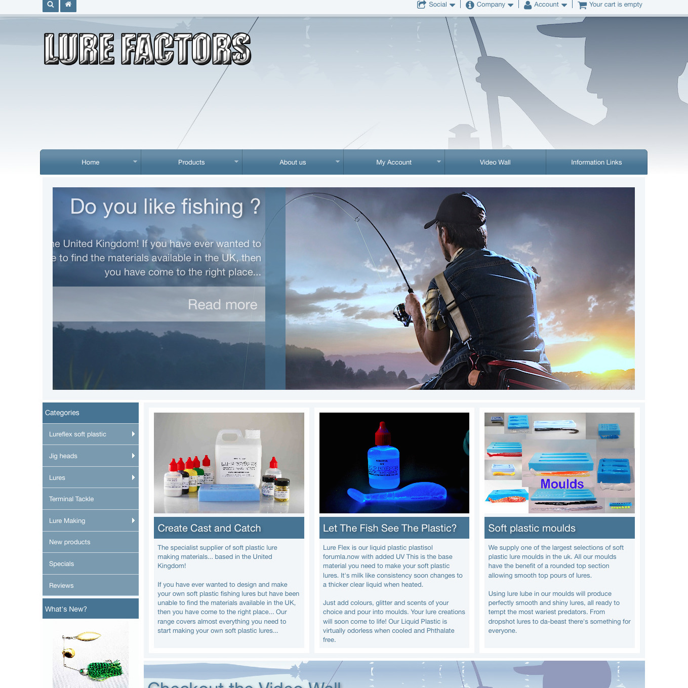
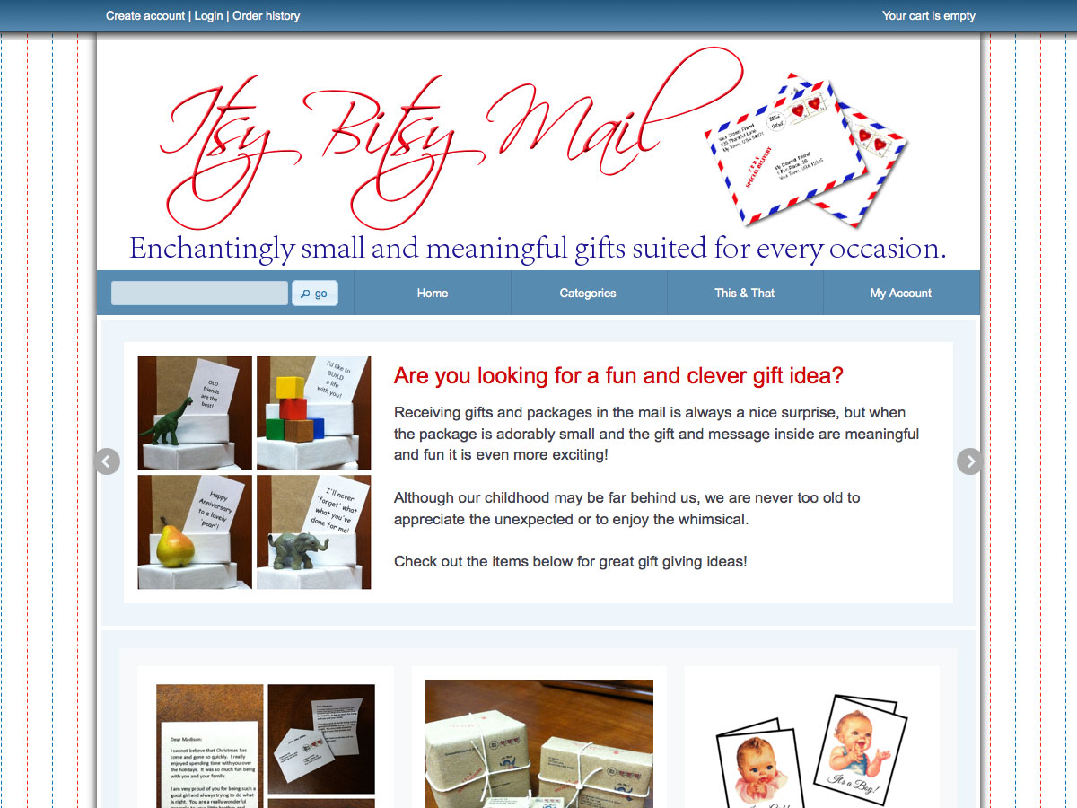
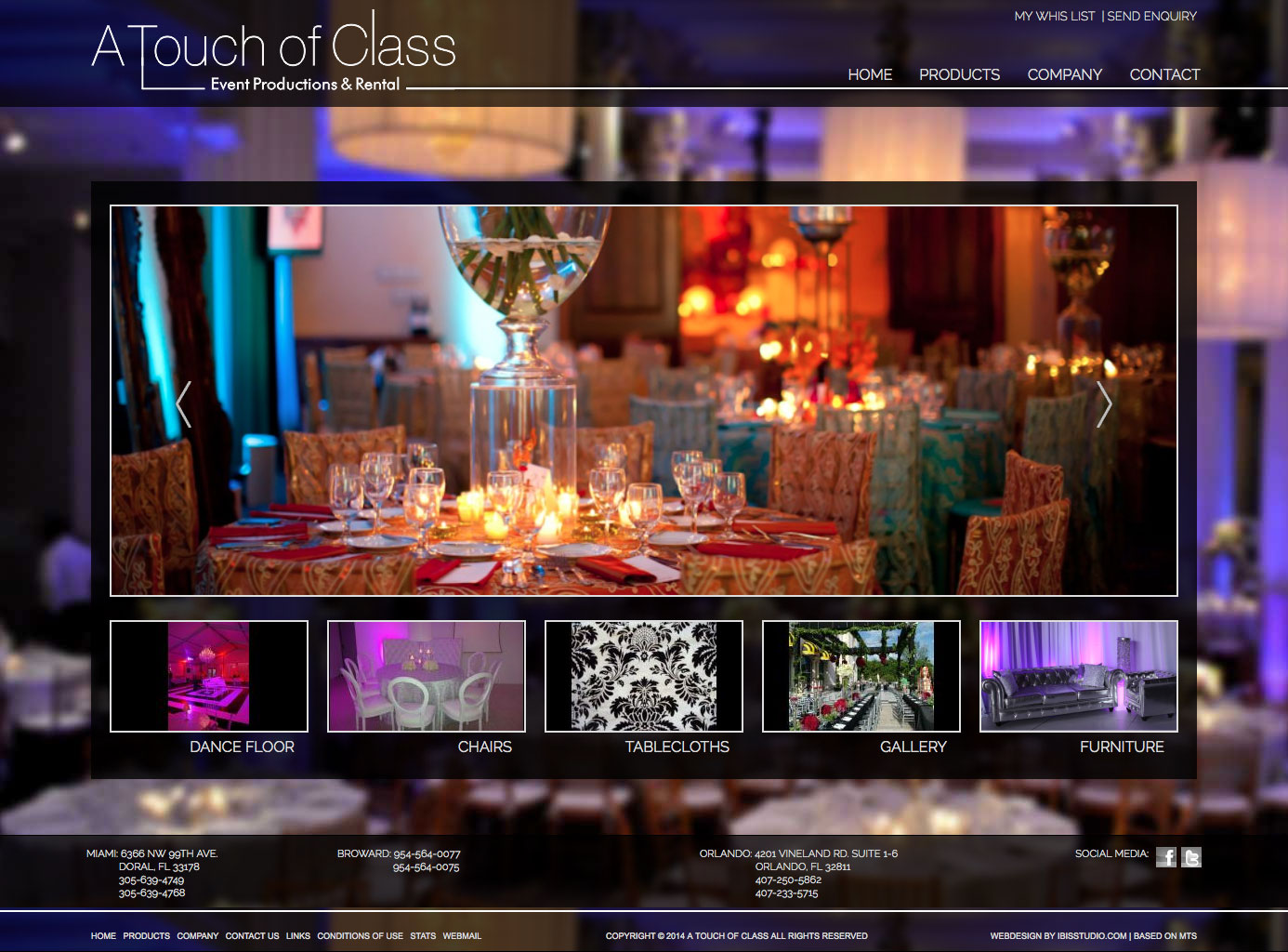
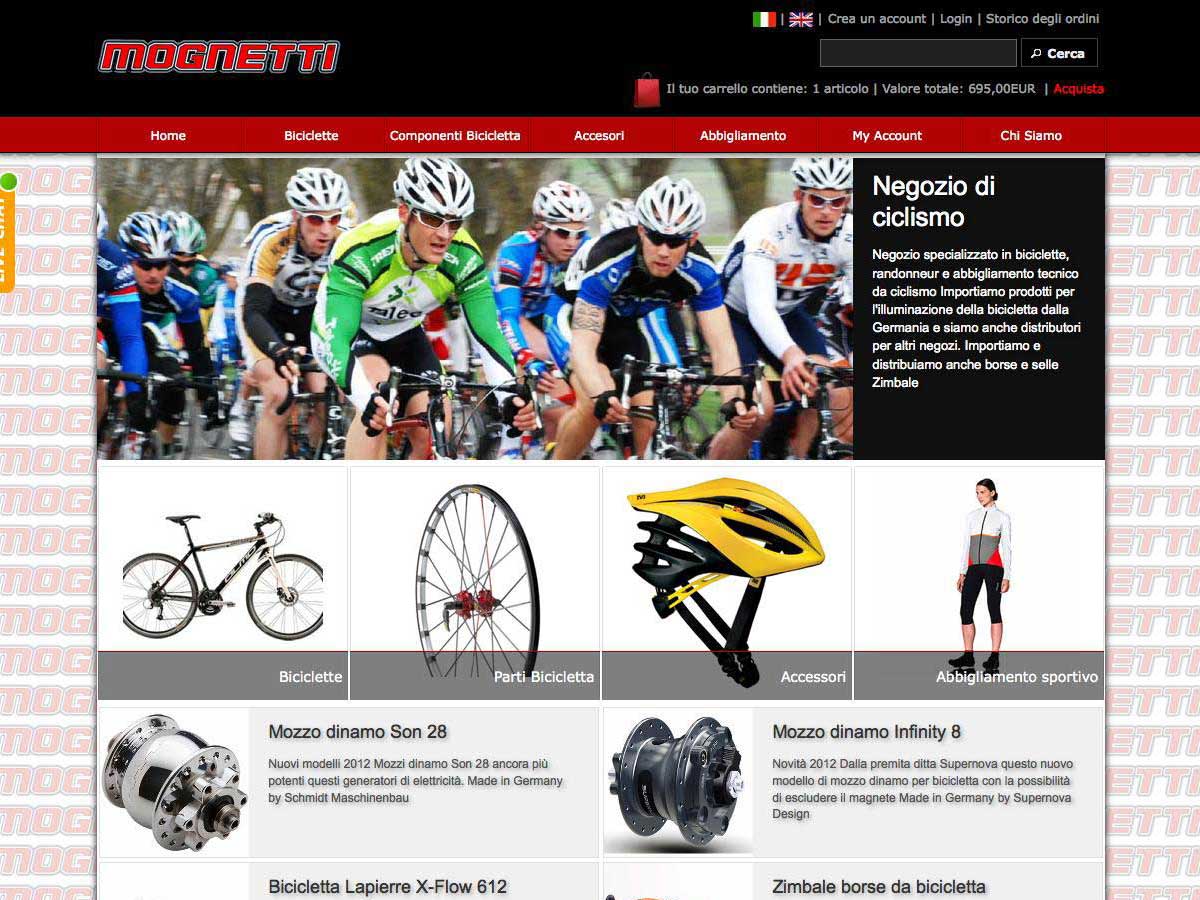
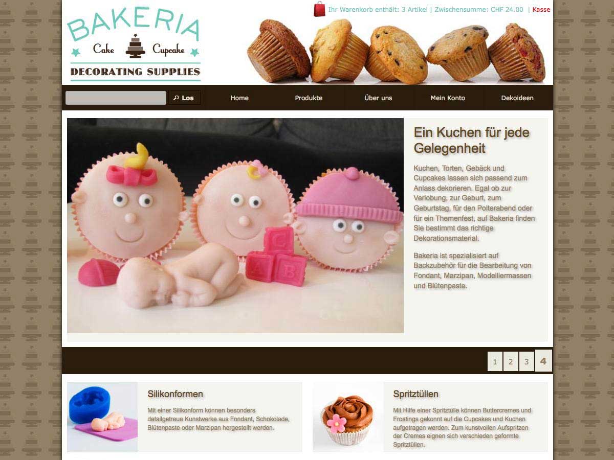
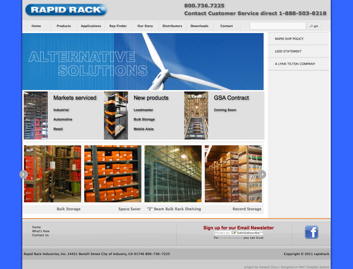
In this setup example we are going to use the banner group “image and text”. You will find the same banner group in your installation. That means that all contents of this group will be the contents of the banner slider. This banner group is set up in that way, that it contains images, a text heading and a short description

To set a banner group to be displayed, simply select it from the drop down menu

Press on “save” and go to your store to see the result. The default osCommerce front page content has been replaced by a sliding banner.

Next step is to start doing configuration settings
Basic setup
You can make following decisions
- Display mode: You can select if you want the banners to be displayed as a slider or as a grid. Selecting “grid” you will get a static display of images and/or text on the front page. This is a very convenient way to place any type of content to the front page, since banners can contain images, text or any html, such as videos etc
- Respect margins: Here you can decide if you want the module to respect the store margins or to expand till the edge of the available store width. Setting this to “yes” the module will adjust within the content margins. Setting it to “no” the module will occupy the full available width
- Number of items: This is the total number of items to be displayed. Your banner group can contain eg 20 banners, if you set this number to 5, only the first 5 banners of the group will be dispayed
- Items per row: In case of a display as a “grid” the number set the banners per row. After this number is reached, and if there are still more banners to display, a new row will start. In case of a display as a “slider” the number set the the banners to be displayed at the same time on the screen. Each sliding “caption” can consist of 1 banner (that’s the most common setting) or more.
- Display order: Here you can set the banners to display always in the same order (fixed) or to have a random order, different on each page load (random)
- Not enough items: Here you can decide what to do with the module in case the total available items are less that the selected items per row. If you select for example to display 5 items per row, but you have only 3 banners activated and available in the banner manager, how should the module behave then? Available settings are “hide” and “display”.
Please note: Banners do adjust their size automatically to the available width. That mean that the same banner image will fill the complete main content width in case it is displayed alone, but only 50% of the width in case you decide to display 2 banners per row. So you don’t need to worry about the actual size of your images, just to make sure that all of them are in the same ratio, since the module does not crop them, but resize them proportionally.
Slider settings
Slider settings are same for all front page modules, please check the section slider settings for details. Please note that any settings in this section are relevant only in case you selected “slider” as a display mode
Container settings
Next set of settings you can do are about the design and layout of the container that hold your banners. Settings will apply in both cases of display, as a grid or as a slider
- Container padding: The top and bottom padding of the container in pixels. You enter add any number
- Container background: The background color of the container. You can select the color using the colorpicker or by entering the hex value without # in front (eg ff0000 for red)
- Container border: Select if you want a border the container that holds the banners. You can select top border, bottom border, top and bottom, or a border all around
- Container border thickness: You can set the border thickness in pixels
- Container border color: You can select the border color using the colorpicker or by entering the hex value without # in front (eg ff0000 for red)
Boxes settings
Next set of settings you can do are about the design and layout of your banners. Settings will apply in both cases of display, as a grid or as a slider
- Boxes margin: you can set the distance of the banners to each other in pixels. In case you have just one banner per row, this will set the left and right margin of this banner from the page edge additional to any container padding that you have added
- Equal margin: This setting will use the same margin that you have between the banners also for the distance of the banners to the edge of the container. Say for example, you have 3 banners in grid mode and set a margin between them of 10 pixels. Till now the result was that banners will have a distance of 10 pixels from the container edge but 20 pixels between them. Using the new setting you can have an equal margin of 20 pixels
- Boxes border: Select if you want a border around each banner
- Boxes border thickness: You can set the border thickness in pixels
- Boxes border color: You can select the border color using the colorpicker or by entering the hex value without # in front (eg ff0000 for red)
- Boxes border hover color: The color of the border upon hover. This is a nice way to highlight the selected banner
- Boxes content background color: The background color for the banners. If your banner consist just of an image, this setting is irrelevant. If you are going to use any text, this will be the text background color.
Image and text settings
In case you added also a text for your banners using the banner manager, you can also do following settings
- Display text: Decide if you want to display title and description of the banner. You have following options: no, to not display any text, captions, to display a text as an image caption, that will appear upon hover and screen to display the text beside the banner permanently on the screen
- Image position: In case you selected “screen” for the text display you can decide if you want the text to appear on the left or right of the banner image
- Image size: In case of “screen” you can set how many percent of the available space the image should occupy. For example, if you have set 1 item per row and you set this setting to 30, the image will occupy 30% of the page content. If you have 2 banners per row, and you set this setting to 50, then the image will occupy 50% of the half of the screen, that means 25%. Any resizing happens automatically. What you need to take care of is, that all of your images have exactly the same ration, eg they are all square, or are all in 3:2 etc
- Caption direction: In case you decided the text to be displayed as a caption upon hover, you can now select the direction you want the this caption to appear from. Available options are top, bottom, left, right. Captions do use a decent animation effect when appearing
- Caption background color: Captions use by default a semi transparent color, depending on the chosen color scheme. You can change this by selecting any color using the colorpicker
- Title align: That is the alignment of the banner heading you entered via the banner manager Available options are left, right, center
- Text align: That is the alignment of the banner text you entered via the banner manager Available options are left, right, center and justify
- Title size: The size of the banner heading in pixels
- Text size: The size of the banner text in pixels
- Title color: The color of the banner heading
- Title hover color: In case the banner title is a link you can set the color upon hover here. The banner title become a link in case the banner is linked to anywhere, this is a setting you can do using banner manager
- Text color: The color of the banner text
- Title shadow: Select if you want a css shadow effect to be used for the banner heading. Please note that this feature is supported only by browsers that suppot css3. It will not be visible in IE8 for example. In this cases a common plain text will be displayed
- Text shadow: Select if you want a css shadow effect to be used for the banner text
Please note following limitations: Text shadow is supported only by browsers that suppot css3. It will not be visible in IE8 for example. In this cases a common plain text will be displayed.